Shop
DreamUp AI Art
DreamUp
Join
Log In
User Menu
Upgrade to Core
Theme
Display Mature Content
Suppress AI Content
Get Help and Send Feedback
Terms of Service
Privacy Policy
Submit
Deviation
Submit your art
Upload your creations for people to see, favourite, and share.
DreamUp
Turn your dreams into reality
Generate your own AI work.
Status Update
Post an update
Tell the community what’s on your mind.
Journal
Post a journal
Share your thoughts, experiences, and stories behind the art.
Literature
Submit your writing
Upload stories, poems, character descriptions & more.
Subscription
Get your fans' support
Fund your creativity by creating subscription tiers.
ignitepjp on DeviantArt
https://www.deviantart.com/ignitepjp/art/REPS-54283214
ignitepjp
Deviation Actions
Add to Favourites
Comment
8
Favourites
Make the first offer!
Beautiful Form 0033
MetshaCollective
$20
Starting offer
Buy Exclusive
More by
ignitepjp
Watch
ignitepjp on DeviantArt
https://www.deviantart.com/ignitepjp/art/shift-425614036
ignitepjp
ignitepjp on DeviantArt
https://www.deviantart.com/ignitepjp/art/someday-50818293
ignitepjp
ignitepjp on DeviantArt
https://www.deviantart.com/ignitepjp/art/the-mold-of-color-168541080
ignitepjp
ignitepjp on DeviantArt
https://www.deviantart.com/ignitepjp/art/the-sins-of-my-afterlife-88203671
ignitepjp
ignitepjp on DeviantArt
https://www.deviantart.com/ignitepjp/art/play-145359573
ignitepjp
ignitepjp on DeviantArt
https://www.deviantart.com/ignitepjp/art/GODSPEED-51782237
ignitepjp
ignitepjp on DeviantArt
https://www.deviantart.com/ignitepjp/art/polychromasia-168541212
ignitepjp
ignitepjp on DeviantArt
https://www.deviantart.com/ignitepjp/art/the-breaks-over-149356939
ignitepjp
ignitepjp on DeviantArt
https://www.deviantart.com/ignitepjp/art/with-you-36773186
ignitepjp
Suggested Deviants
lyky90
Watch
lyky90 on DeviantArt
https://www.deviantart.com/lyky90/art/Minimal-342789658
lyky90
lyky90 on DeviantArt
https://www.deviantart.com/lyky90/art/Neutral-415615332
lyky90
lyky90 on DeviantArt
https://www.deviantart.com/lyky90/art/Triangles-342165065
lyky90
CollectiveArtConglom
Watch
CollectiveArtConglom on DeviantArt
https://www.deviantart.com/collectiveartconglom/art/Ethereal-Art-1002380952
CollectiveArtConglom
CollectiveArtConglom on DeviantArt
https://www.deviantart.com/collectiveartconglom/art/Ethereal-Art-1009512975
CollectiveArtConglom
CollectiveArtConglom on DeviantArt
https://www.deviantart.com/collectiveartconglom/art/Ethereal-Art-1006988968
CollectiveArtConglom
Naarok0fKor
Watch
Naarok0fKor on DeviantArt
https://www.deviantart.com/naarok0fkor/art/Fractal120a-908442176
Naarok0fKor
Naarok0fKor on DeviantArt
https://www.deviantart.com/naarok0fkor/art/Fractal81B-866377021
Naarok0fKor
Naarok0fKor on DeviantArt
https://www.deviantart.com/naarok0fkor/art/Abstrait336B-862434047
Naarok0fKor
Suggested Collections
Abstract
WMill on DeviantArt
https://www.deviantart.com/wmill/art/Ethereal-465435307
WMill
WMill on DeviantArt
https://www.deviantart.com/wmill/art/Ravine-399528598
WMill
zilla774 on DeviantArt
https://www.deviantart.com/zilla774/art/bound-52971494
zilla774
Abstract
Amytea on DeviantArt
https://www.deviantart.com/amytea/art/Zenethra-522298751
Amytea
intoadaze on DeviantArt
https://www.deviantart.com/intoadaze/art/Xyche-346969270
intoadaze
elreviae on DeviantArt
https://www.deviantart.com/elreviae/art/Eyecatcher-464558463
elreviae
fractals
dark-beam on DeviantArt
https://www.deviantart.com/dark-beam/art/Armonia-del-triangolo-766331896
dark-beam
C-91 on DeviantArt
https://www.deviantart.com/c-91/art/One-538125397
C-91
tatasz on DeviantArt
https://www.deviantart.com/tatasz/art/Hacked-406324358
tatasz
You Might Like…
lyky90 on DeviantArt
https://www.deviantart.com/lyky90/art/Minimal-342789658
lyky90
ChaosApostle on DeviantArt
http://creativecommons.org/licenses/by-nc-nd/3.0/
https://www.deviantart.com/chaosapostle/art/Disc-and-Mirrors-130658735
ChaosApostle
skzr on DeviantArt
https://www.deviantart.com/skzr/art/V-O-I-D-606554850
skzr
COOLZONE17500 on DeviantArt
https://www.deviantart.com/coolzone17500/art/Secret-Society-791051243
COOLZONE17500
phusion on DeviantArt
https://www.deviantart.com/phusion/art/mk-delta-dual-tone-124338
phusion
Rychveldir on DeviantArt
http://creativecommons.org/licenses/by-nc-sa/3.0/
https://www.deviantart.com/rychveldir/art/Darkening-888371790
Rychveldir
the-one-an-only on DeviantArt
https://www.deviantart.com/the-one-an-only/art/Memory-Spark-135252019
the-one-an-only
alucard07 on DeviantArt
http://creativecommons.org/licenses/by-nc-nd/3.0/
https://www.deviantart.com/alucard07/art/Cross-158777981
alucard07
WMill on DeviantArt
https://www.deviantart.com/wmill/art/29-5-15-B-551276454
WMill
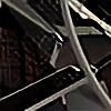
REPS
By
ignitepjp
Watch
Published:
Apr 30, 2007
2
Favourites
9
Comments
297
Views
Description
repetition - meant to have some negative space behind it all
comments appreciated
i think the text may be a bit too sharp, just looking at it but im not quite sure.
Image size
1459x586px 183.04 KB
© 2007 - 2024
ignitepjp
Comments
9
Join the community
to add your comment. Already a deviant?
Log In
forexus
May 8, 2007
Cool!
Reply
Load more


![[Ravine]](https://images-wixmp-ed30a86b8c4ca887773594c2.wixmp.com/f/91a9dfb9-e0a6-4b9b-85a4-b5597961f379/d6lva8m-20fbe482-053c-4031-a623-00c868490fe1.png/v1/crop/w_184,h_184,x_0,y_0,scl_0.092/_ravine__by_wmill_d6lva8m-92s-2x.png?token=eyJ0eXAiOiJKV1QiLCJhbGciOiJIUzI1NiJ9.eyJzdWIiOiJ1cm46YXBwOjdlMGQxODg5ODIyNjQzNzNhNWYwZDQxNWVhMGQyNmUwIiwiaXNzIjoidXJuOmFwcDo3ZTBkMTg4OTgyMjY0MzczYTVmMGQ0MTVlYTBkMjZlMCIsIm9iaiI6W1t7ImhlaWdodCI6Ijw9OTAwIiwicGF0aCI6IlwvZlwvOTFhOWRmYjktZTBhNi00YjliLTg1YTQtYjU1OTc5NjFmMzc5XC9kNmx2YThtLTIwZmJlNDgyLTA1M2MtNDAzMS1hNjIzLTAwYzg2ODQ5MGZlMS5wbmciLCJ3aWR0aCI6Ijw9OTAwIn1dXSwiYXVkIjpbInVybjpzZXJ2aWNlOmltYWdlLm9wZXJhdGlvbnMiXX0.2cfhfyuyQ7p6J-bBZGLhzFISeZYHswQshL6HRbe6m2c)
![[Ravine]](https://images-wixmp-ed30a86b8c4ca887773594c2.wixmp.com/f/91a9dfb9-e0a6-4b9b-85a4-b5597961f379/d6lva8m-20fbe482-053c-4031-a623-00c868490fe1.png/v1/crop/w_92,h_92,x_0,y_0,scl_0.046/_ravine__by_wmill_d6lva8m-92s.png?token=eyJ0eXAiOiJKV1QiLCJhbGciOiJIUzI1NiJ9.eyJzdWIiOiJ1cm46YXBwOjdlMGQxODg5ODIyNjQzNzNhNWYwZDQxNWVhMGQyNmUwIiwiaXNzIjoidXJuOmFwcDo3ZTBkMTg4OTgyMjY0MzczYTVmMGQ0MTVlYTBkMjZlMCIsIm9iaiI6W1t7ImhlaWdodCI6Ijw9OTAwIiwicGF0aCI6IlwvZlwvOTFhOWRmYjktZTBhNi00YjliLTg1YTQtYjU1OTc5NjFmMzc5XC9kNmx2YThtLTIwZmJlNDgyLTA1M2MtNDAzMS1hNjIzLTAwYzg2ODQ5MGZlMS5wbmciLCJ3aWR0aCI6Ijw9OTAwIn1dXSwiYXVkIjpbInVybjpzZXJ2aWNlOmltYWdlLm9wZXJhdGlvbnMiXX0.2cfhfyuyQ7p6J-bBZGLhzFISeZYHswQshL6HRbe6m2c)